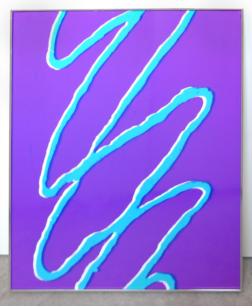
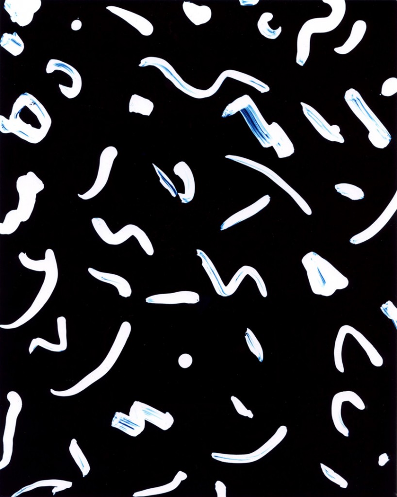
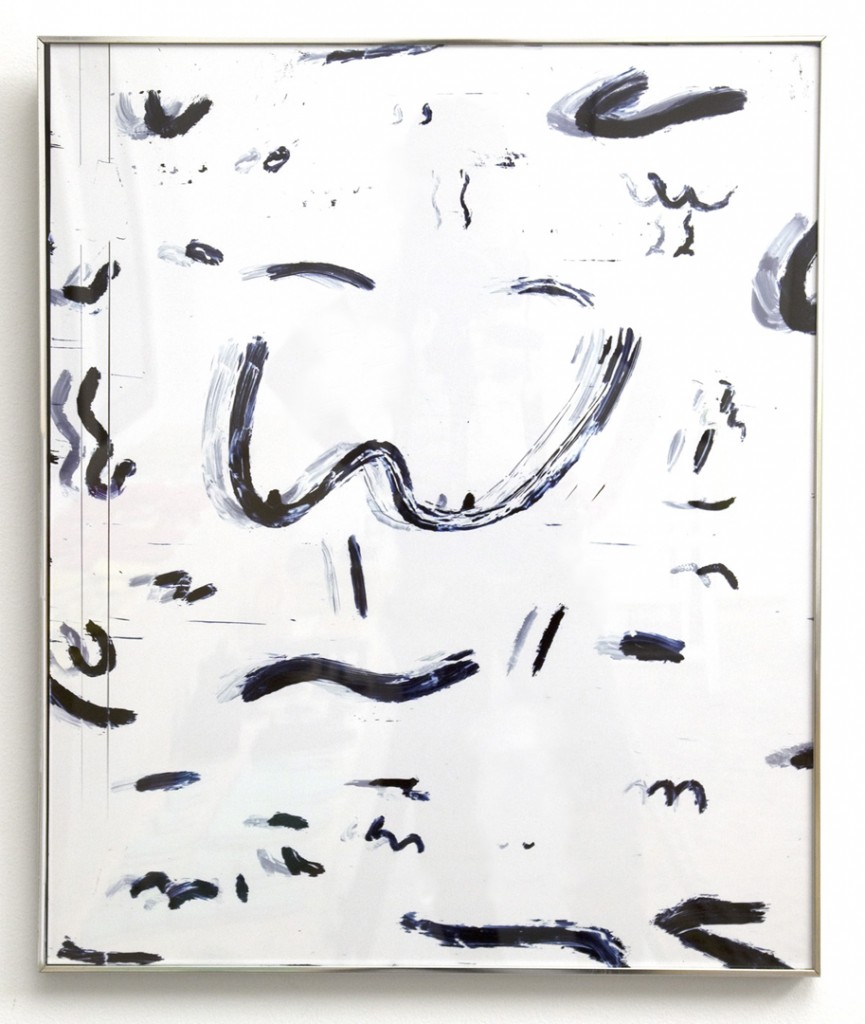
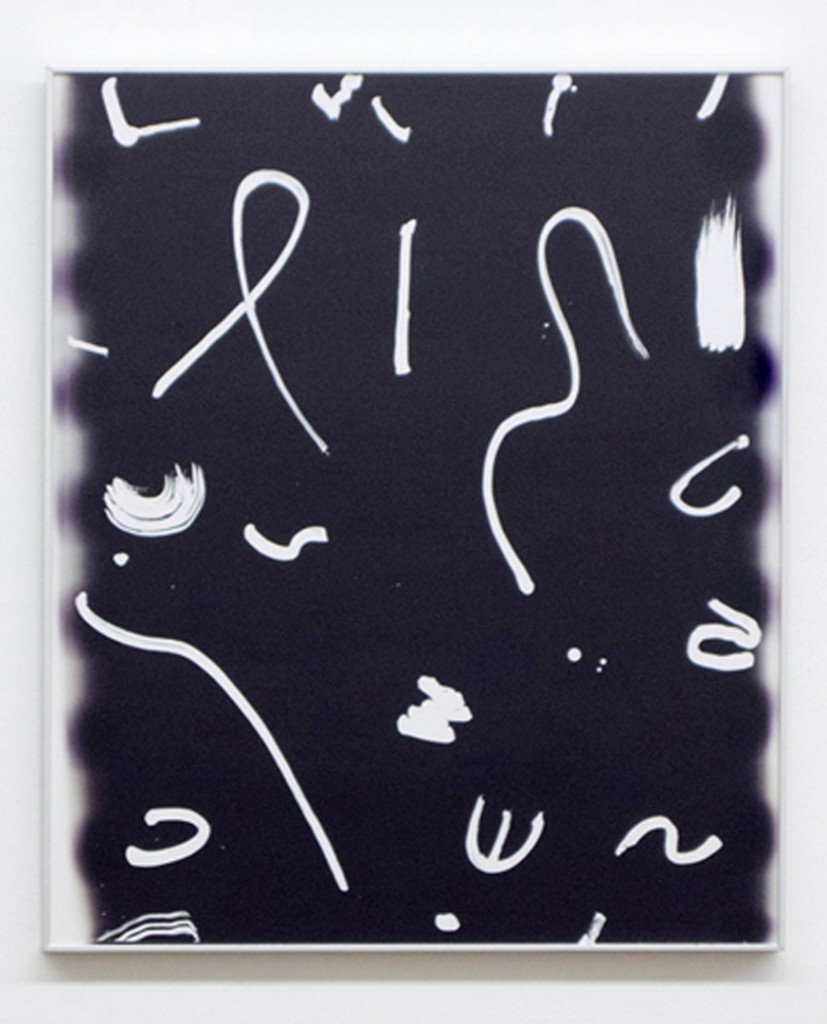
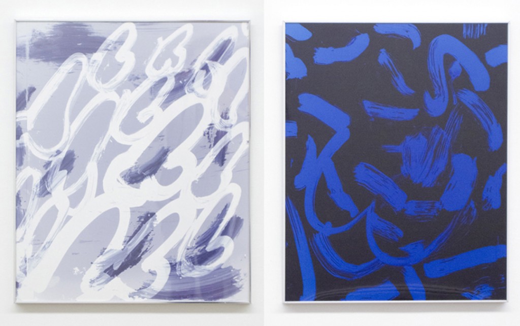
Blue Boobs, c print colorgram, 2012
A Conversation with Pia Howell
Using traditionally photographic materials to create vividly colored abstractions in the darkroom, Pia Howell sidesteps the need to photograph something real. In doing so she perhaps makes photographs that are more direct, translating her good-humored presence onto type-c paper in a fanciful yet cannily culturally conscious language of mark and gesture.
Wild! Berry, c print colorgram, 2011
MATTE: When did you decide to start painting with the darkroom? Was there a time when you made “straight photographs”? If so, what prompted the transition?
PH: I got the idea to start painting in the darkroom a couple of years ago after thinking a lot about the “painted” frosting designs on pop tarts. I wanted to recreate the wild berry pop tart design as a c print, and the best way to do that was to paint it onto a large transparency. From that experience it became clear that there was a lot to work with from painting transparencies.
Yes I learned traditional printing from negatives in both black and white and color, and there was a brief time when I was making “straight” photographs. The urge to experiment came largely from a frustration with having to find subjects and content to photograph (as opposed to creating it), as well as an interest in facing the materiality of photography rather than keeping it latent. I’ve always been most driven to work in photography but I might actually be more of a painter or sculptor at heart?
Black Smiley, c print colorgram, 2012
Sad Confusion, c print, 2012
Witch Work, unique c print, 2012
MATTE: Can/do you edition your pieces, or are they one-off?
PH: Editioning my work is probably closer to printmaking than photography. Though the printmakers I’ve met seem to be hardcore perfectionists about editions. Personally I feel like each print I make is technically unique since I am moving all the components (transparencies and set up) between making each print, but for exhibition purposes it makes a lot of sense to create editions. My idea of an edition can get pretty loose. But as long as 2 prints look almost exactly the same and are going for the same effect, I think they are an edition even if they are registered slightly differently.
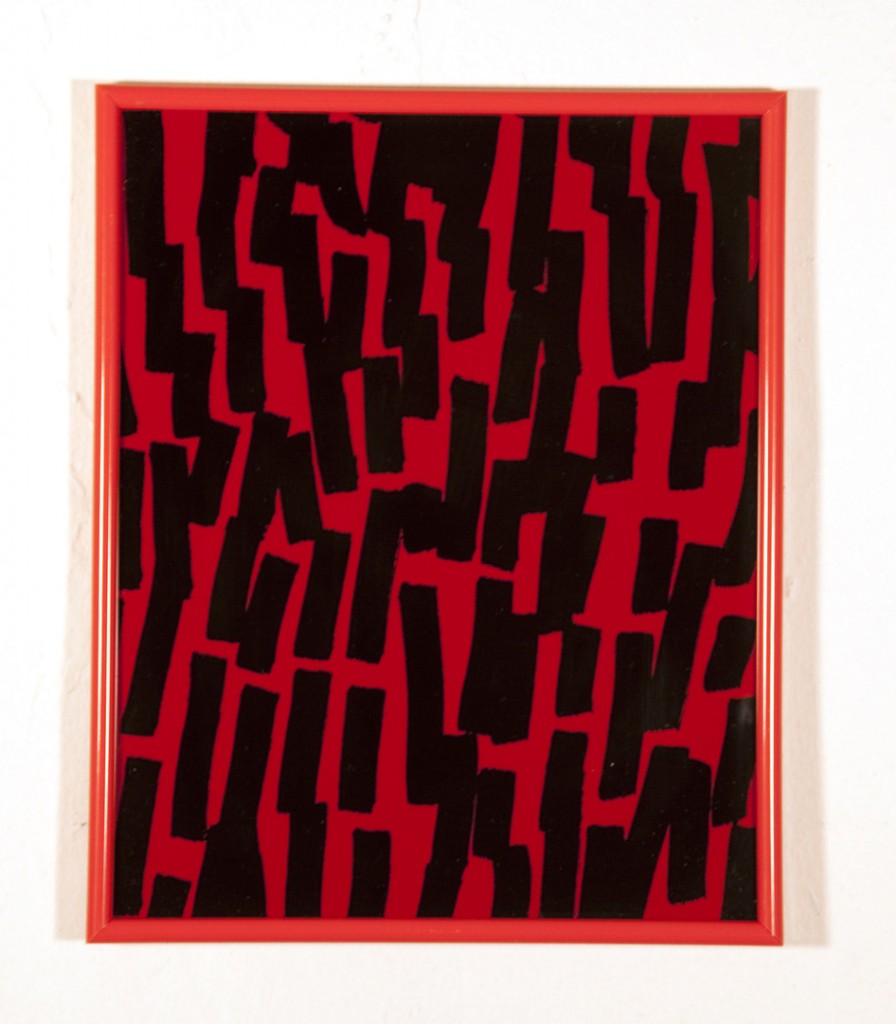
Red Marks, c print colorgram, 2009
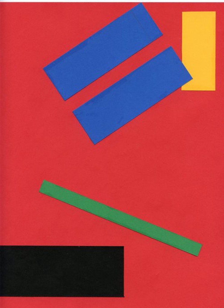
Abstract Olympics, collage, 2011
Red Marlboro, unique c print colorgram, 2009
MATTE: How do you come up with the color of palette for a specific work?
PH: I’ve always made a lot of little abstract paper collages, and through that have been very interested in strange color combinations. I have palettes in my mind that I’m working towards…In the darkroom it can be difficult to achieve a specific subtle color, say a pastel for example, and at the same time adding another color adds considerable complexity to a print, so often the palettes of c prints I make are more limited than I’d like them to be eventually.
MATTE: How do you begin to compose an image?
PH: Yeah that’s hard because my images transition between so many materials. I usually just have to jump in and start painting something, which often works when I want something to look chaotic or careless. Sometimes I make a composition I like immediately; other times I have to rework a composition by combining elements from different paintings, scanning, enlarging, copying, tracing, photocopying etc.
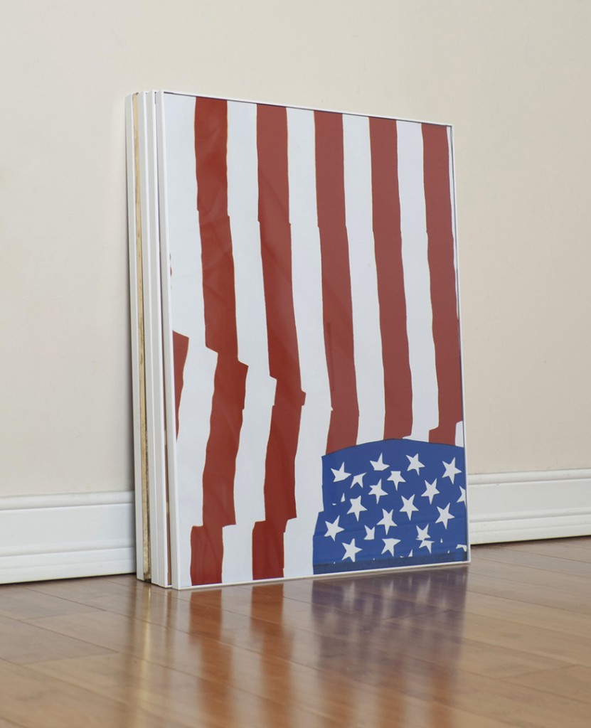
Flag, c print colorgram, 2011
MATTE: Why are you a member of CCNY?
PH: I love CCNY- it’s such a unique resource. I became an intern towards the end of college, and stayed on so that I could keep working in the darkroom after I was out of school. Analog darkrooms, especially color darkrooms, are so rare these days- I hear all the time about art institutions disassembling their color darkrooms. This may sound crazy but I think it’s premature; there is still a lot of potential for interesting work to be made through analog printing.
-MATTE Magazine for CCNY

